Layout Component
The theme is configured with the <Layout> component. You should pass your
config options as Layout’s props, for example:
import { Layout } from 'nextra-theme-docs'

export default function MyLayout({ children, ...props }) {
  return (
    <html lang="en">
      <body>
        <Layout
          sidebar={{ autoCollapse: true }}
          docsRepositoryBase="https://github.com/shuding/nextra/tree/main/docs"
        >
          {children}
        </Layout>
      </body>
    </html>
  )
}
Detailed information for each option is listed below.
Props
Page Map
| Name | Type | Default |
|---|---|---|
pageMap | PageMapItem[]Page map list. Result of |
Banner
| Name | Type | Default |
|---|---|---|
banner | React.ReactNodeRendered |
Navbar
| Name | Type | Default |
|---|---|---|
navbar | React.ReactNodeRendered |
Toggle Visibility
You can toggle visibility of the <Navbar> on the specific pages by setting theme.navbar property in the _meta.js file:
export default {
  'my-page': {
    theme: {
      navbar: false // Hide navbar on this page
    }
  }
}
Footer
| Name | Type | Default |
|---|---|---|
footer | React.ReactNodeRendered |
Toggle Visibility
You can toggle visibility of the <Footer> on the specific pages by setting theme.footer property in the _meta.js file:
export default {
  'my-page': {
    theme: {
      footer: false // Hide footer on this page
    }
  }
}
Search
| Name | Type | Default |
|---|---|---|
search | React.ReactNodeRendered | <Search /> |
Docs Repository
Set the repository URL of the documentation. It’s used to generate the “Edit this page” link, the “Feedback” link and “Report of broken link” on not found page .
| Name | Type | Default |
|---|---|---|
docsRepositoryBase | stringURL of the documentation repository. | "https://github.com/shuding/nextra" |
Specify a Path
If the documentation is inside a monorepo, a subfolder, or a different branch of
the repository, you can simply set the docsRepositoryBase to the root path of
the app/ (App Router) folder of your docs. For example:
<Layout docsRepositoryBase="https://github.com/shuding/nextra/tree/main/docs">
  {children}
</Layout>
Then Nextra will automatically generate the correct file path for all pages.
Dark Mode and Themes
Customize the theme behavior of the website.
| Name | Type | Default |
|---|---|---|
darkMode | booleanShow or hide the dark mode select button. | true |
nextThemes | { attribute?: "class" | `data-${string}` | ("class" | `data-${string}`)[]; defaultTheme?: string; disableTransitionOnChange?: boolean; forcedTheme?: string; storageKey?: string; }Configuration for the next-themes package. | {
"attribute": "class",
"defaultTheme": "system",
"disableTransitionOnChange": true,
"storageKey": "theme"
} |
Edit Link
Show an “Edit this page” link on the page that points to the file URL on GitHub (or other places).
| Name | Type | Default |
|---|---|---|
editLink | React.ReactNodeContent of the edit link. | "Edit this page" |
To disable it, you can set editLink to null.
Feedback Link
The built-in feedback link provides a way for users to submit feedback about the documentation.
| Name | Type | Default |
|---|---|---|
feedback.content | React.ReactNodeContent of the feedback link. | "Question? Give us feedback" |
feedback.labels | stringLabels that can be added to the new created issue. | "feedback" |
feedback.link | stringFeedback link URL. By default, it’s a link to the issue creation form of the docs repository, with the current page title prefilled: example . |
To disable it, you can set feedback.content to null.
I18n
| Name | Type | Default |
|---|---|---|
i18n | { locale: string; name: string; }[]Options to configure the language dropdown for the i18n docs website. | [] |
Last Updated Date
Show the last updated date of a page. It’s useful for showing the freshness of the content.
| Name | Type | Default |
|---|---|---|
lastUpdated | React.ReactElementComponent to render the last updated info. | <LastUpdated /> |
Toggle Visibility
You can toggle visibility of the last update date on the specific pages by setting theme.timestamp property in the _meta.js file:
export default {
  'my-page': {
    theme: {
      timestamp: false // Hide timestamp on this page
    }
  }
}
Navigation
Show previous and next page links on the bottom of the content. It’s useful for navigating between pages.
| Name | Type | Default |
|---|---|---|
navigation | boolean | { next: boolean; prev: boolean; }Enable or disable navigation link. | true |

<Layout
  navigation={{
    prev: true,
    next: true
  }}
>
  {children}
</Layout>
The above is also equivalent to navigation: true.
Toggle Visibility
You can toggle visibility of the navigation on the specific pages by setting theme.pagination property in the _meta.js file:
export default {
  'my-page': {
    theme: {
      pagination: false // Hide pagination on this page
    }
  }
}
Sidebar
Menu Collapse Level
By default, the sidebar menu is collapsed at level 2. You can change it by
setting sidebar.defaultMenuCollapseLevel to a different number. For example,
when set to 1, every folder will be collapsed by default and when set to
Infinity, all nested folders will be expanded by default.
If sidebar.autoCollapse is set to true, then all folders that do not contain
an active/focused route will automatically collapse up to the level set by
sidebar.defaultMenuCollapseLevel. e.g. if defaultMenuCollapseLevel is 2,
then top-level folders will not auto-collapse.
Customize Sidebar Content
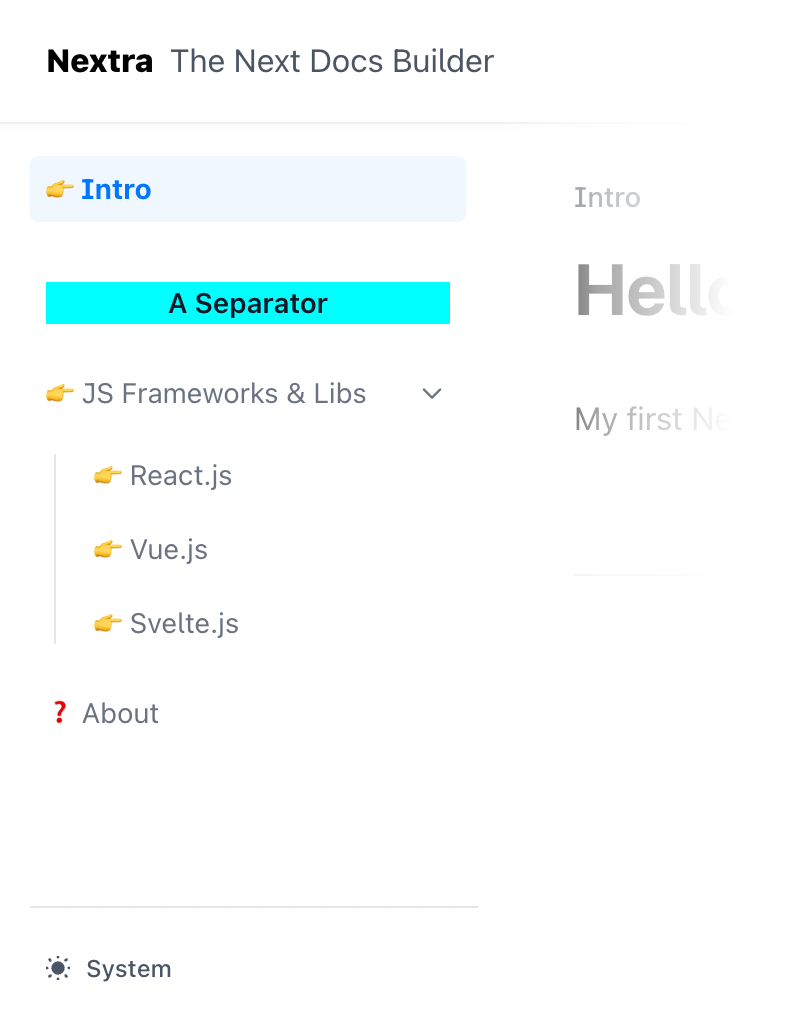
Together with the Separators item, you can customize how the sidebar content is rendered by using JSX elements:
export default {
  index: 'Intro',
  '--': {
    type: 'separator',
    title: (
      <div className="flex items-center gap-2">
        <MyLogo />
        {children}
      </div>
    )
  },
  frameworks: 'JS Frameworks & Libs',
  about: 'About'
}
Toggle Visibility
You can toggle visibility of the <Sidebar> on the specific pages by setting theme.sidebar property in the _meta.js file:
export default {
  'my-page': {
    theme: {
      sidebar: false // Hide sidebar on this page
    }
  }
}
Customize Sidebar with Front Matter
In addition, you can customize the sidebar title using the sidebarTitle
property in your front matter:
---
sidebarTitle: Getting Started 🚀
---
The priority of the sidebar title is as follows:
- A non-empty title from the
_metafile. sidebarTitlein the front matter.titlein the front matter.- The title derived from the first
h1Markdown heading (e.g.# Dima Machina). - If none of the above are available, it falls back to the filename of the page, formatted according to The Chicago Manual of Style .
Theme Switch
| Name | Type | Default |
|---|---|---|
themeSwitch | { dark?: string; light?: string; system?: string; }Translation of options in the theme switch. | {
"dark": "Dark",
"light": "Light",
"system": "System"
} |
You are able to customize the option names for localization or other purposes:
<Layout
  themeSwitch={{
    dark: 'Темный',
    light: 'Светлый',
    system: 'Системный'
  }}
>
  {children}
</Layout>
Table of Contents (TOC)
Show a table of contents on the right side of the page. It’s useful for navigating between headings.
| Name | Type | Default |
|---|---|---|
toc.backToTop | React.ReactNodeText of back to top button. | "Scroll to top" |
toc.extraContent | React.ReactNodeDisplay extra content below the TOC content. | |
toc.float | booleanFloat the TOC next to the content. | true |
toc.title | React.ReactNodeTitle of the TOC sidebar. | "On This Page" |
Floating TOC
When enabled, the TOC will be displayed on the right side of the page, and it will be sticky when scrolling. If it’s disabled, the TOC will be displayed directly on the page sidebar.
Toggle Visibility
You can toggle visibility of the <TOC> on the specific pages by setting theme.toc property in the _meta.js file:
export default {
  'my-page': {
    theme: {
      toc: false // Hide toc on this page
    }
  }
}