Banner Component
A built-in component to show a banner on the top of the website. It can be used to show a warning or a notice.
Exported from nextra/components.
Props
| Name | Type | Default |
|---|---|---|
dismissible | booleanClosable banner or not. | true |
storageKey | stringStorage key to keep the banner state. | 'nextra-banner' |
...props | HTMLAttributes<HTMLDivElement> |
Example
Banner key
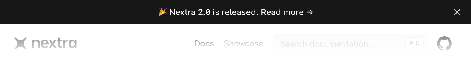
A banner can be dismissed. By default, it’s used by localStorage to keep the banner state on the client.
If you have updated your banner text, you should change the key to make sure the banner is shown again. The best practice is to always use a descriptive key for the current text, for example:
app/layout.jsx
import { Layout } from 'my-nextra-theme'
import { Banner } from 'nextra/components'

export default function MyLayout({ children, ...props }) {
  return (
    <Layout>
      <Banner storageKey="2.0-release">
        <a href="https://nextra.site" target="_blank">
          🎉 Nextra 2.0 is released. Read more →
        </a>
      </Banner>
      {children}
    </Layout>
  )
}